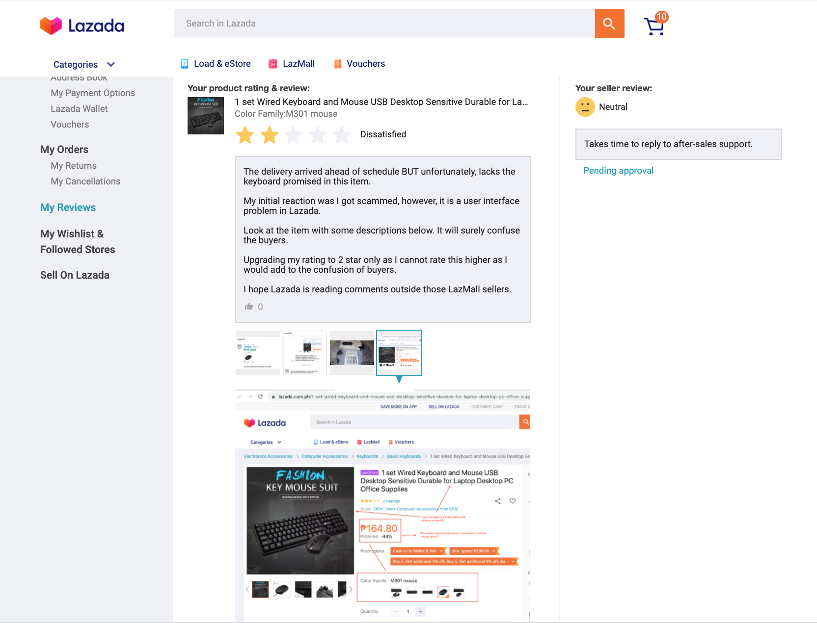
Lazada User Interface Causes Disappointment and Resentment to Buyers.
First week of August, I bought a Raspberry Pi in Lazada. Since it needs a keyboard and mouse and I don’t have one, I searched and bought as well. I selected one that’s unbranded and cheap since this is only for a hobby. I can always upgrade later if needed.
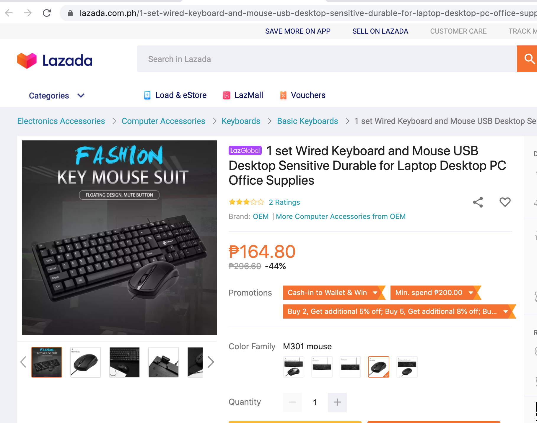
Below was the item I thought I was buying and getting:
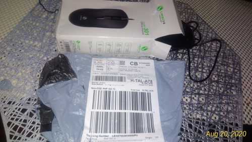
Fast forward to delivery day of the supposed keyboard and mouse, I only received one item: “mouse only”.
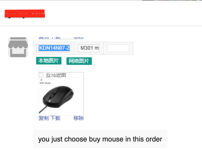
Talked to the seller and got told that my order was for a mouse only. Seller showed me the item’s picture with Chinese characters:
I asked the seller to send the keyboard as it seems to be missing. Seller told me to return back the item to them instead. They will send a refund except for the shipping fee. Given that the item only costs around PHP200 + shipping of PHP 99.00, that would be too much effort with less benefit. So in short, I decided to leave a review instead which I thought was fair enough.
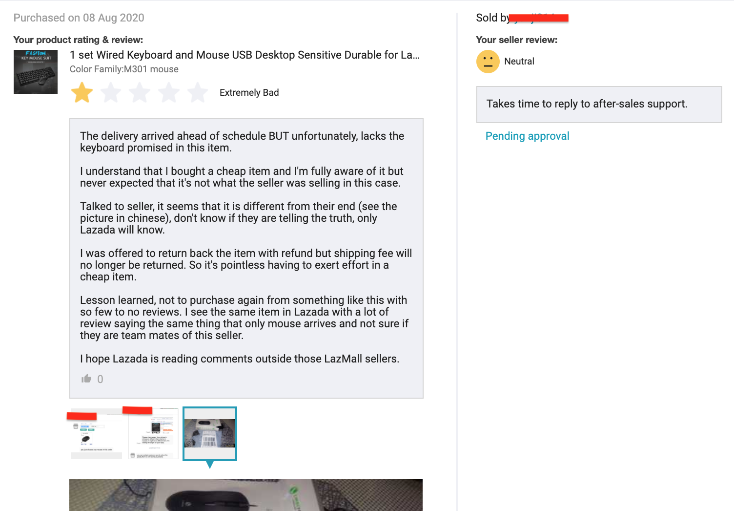
I also informed Lazada messages via support center. Direct messaged them as well through Twitter.
Few days after, I noticed that price changes whenever I click the small pictures to the bottom right of the item.
It’s still an issue though: Buyers will NEVER notice it. Here’s what all buyers had in mind when checking items such as this:
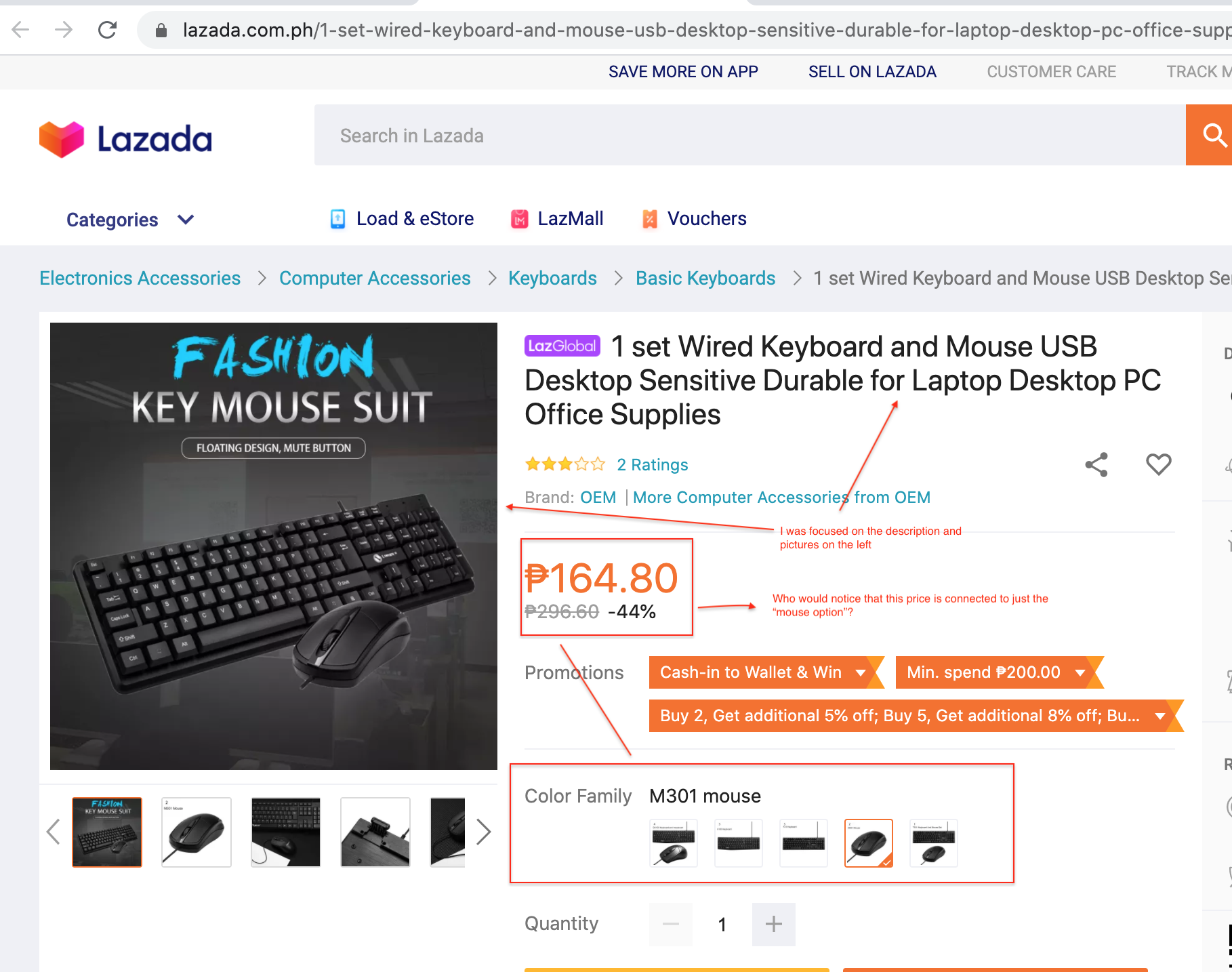
Check the images below as I navigate those so called “customized item option”:
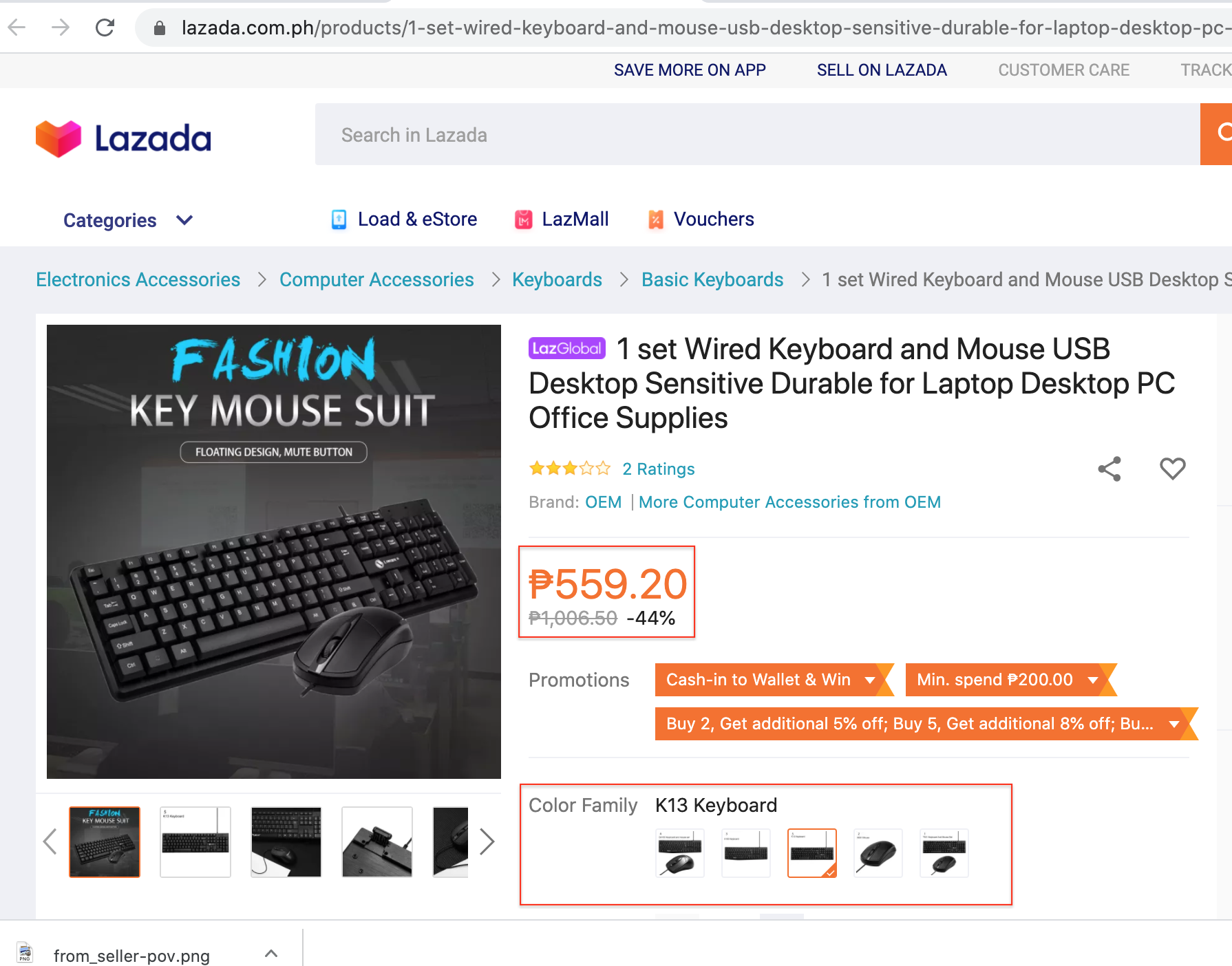
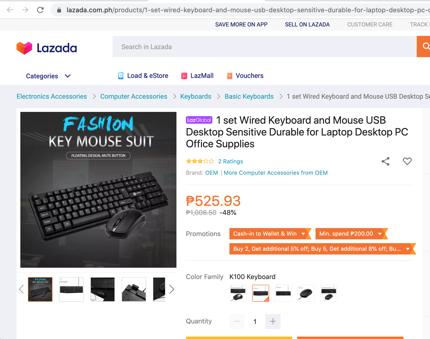
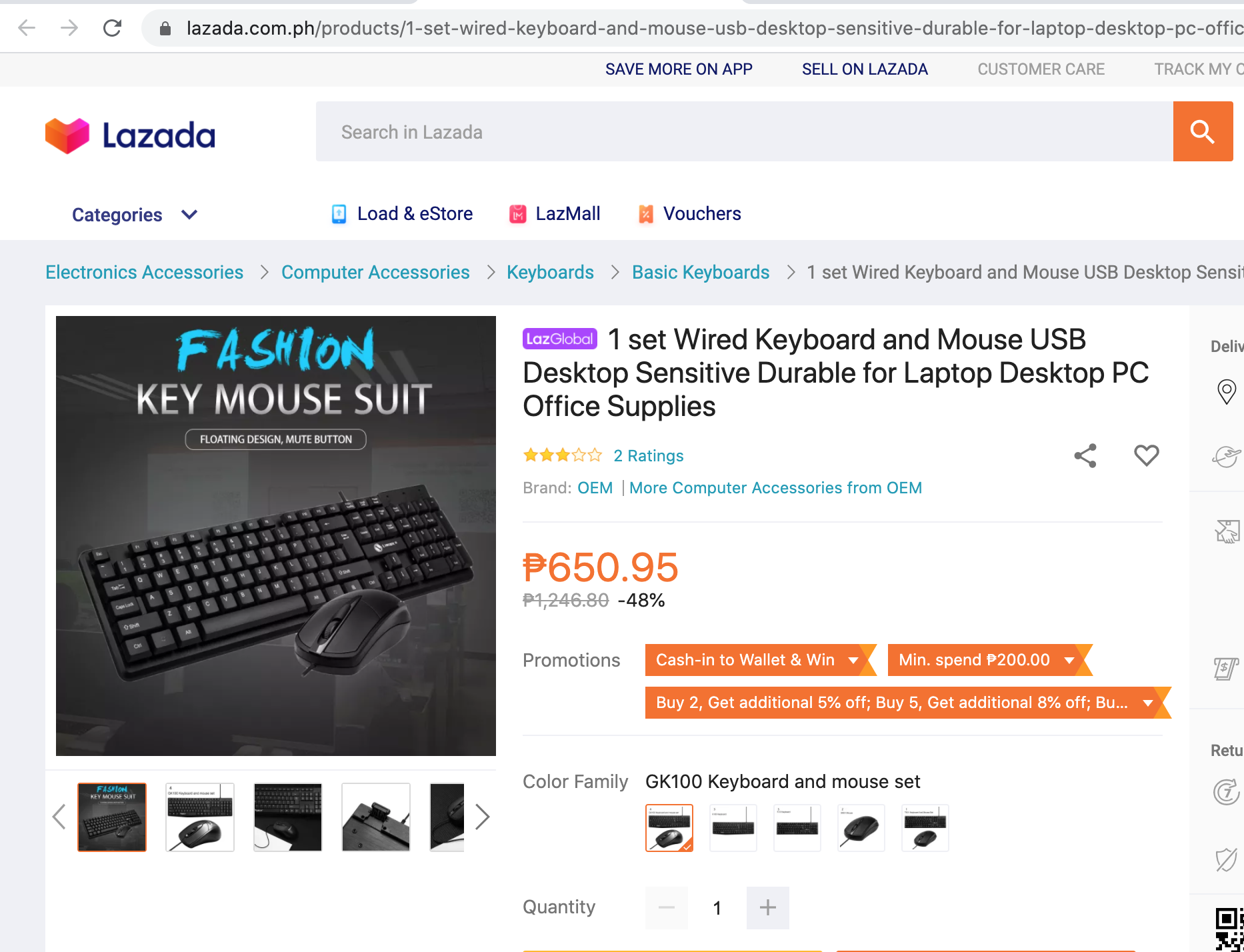
Bug or Evil Feature in Lazada
I think this is more of a bug than an “evil feature”. This may give Lazada an unintended profit but will also erode their user’s trust.
Unsolicited Advise to Sellers
Do not add multiple option to an item that would confuse your potential buyers. You will get bad reviews and will affect you long term profitability.
Unsolicited Advise to Lazada
Hire a more capable usability expert.
Update to item review
I apologized to the seller, updated my review BUT adding only 2 stars… unless Lazada fixes that user-interface issue.
